UI/UX Case study - The Iconic App
UI/UX design | Mobile app design | Prototyping
Meet the app
The Iconic App is developed by The Iconic company, an Australian online fashion and sports retailer based in Sydney. It is one of the best online shopping sites in Australia. It provides top brands worldwide for women, men, kids, home beauty and more. People can shop on the app and expect a speedy delivery after purchases.
Problem statement
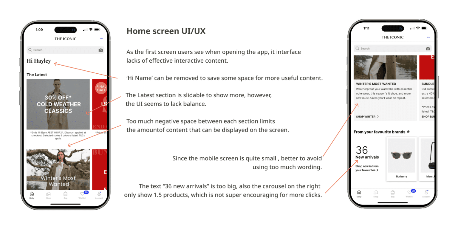
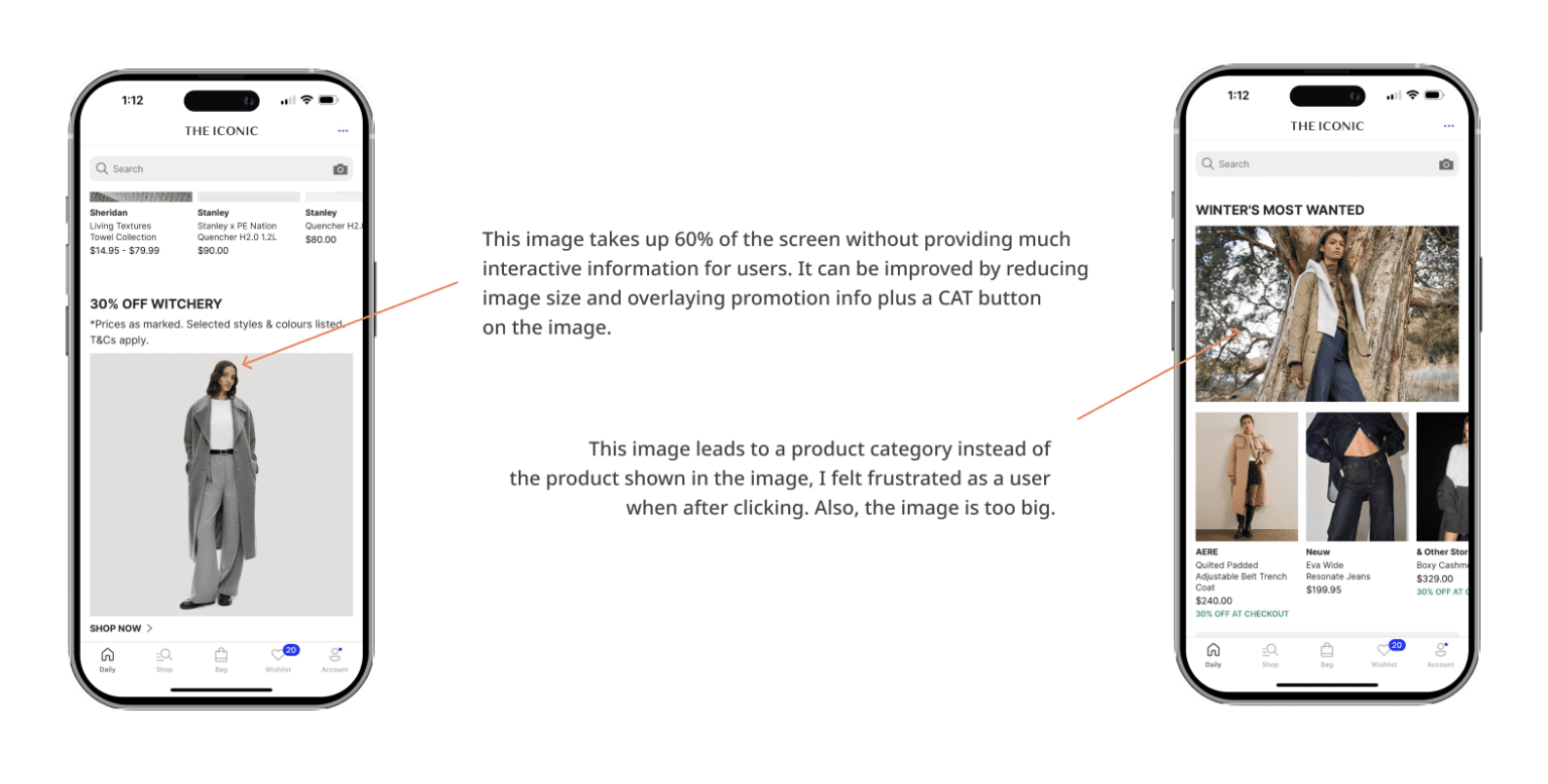
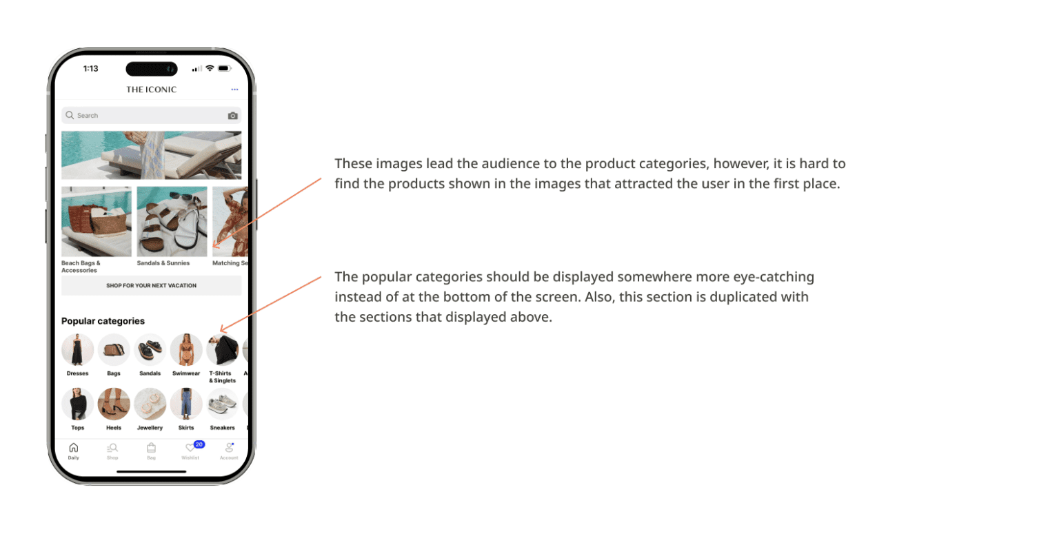
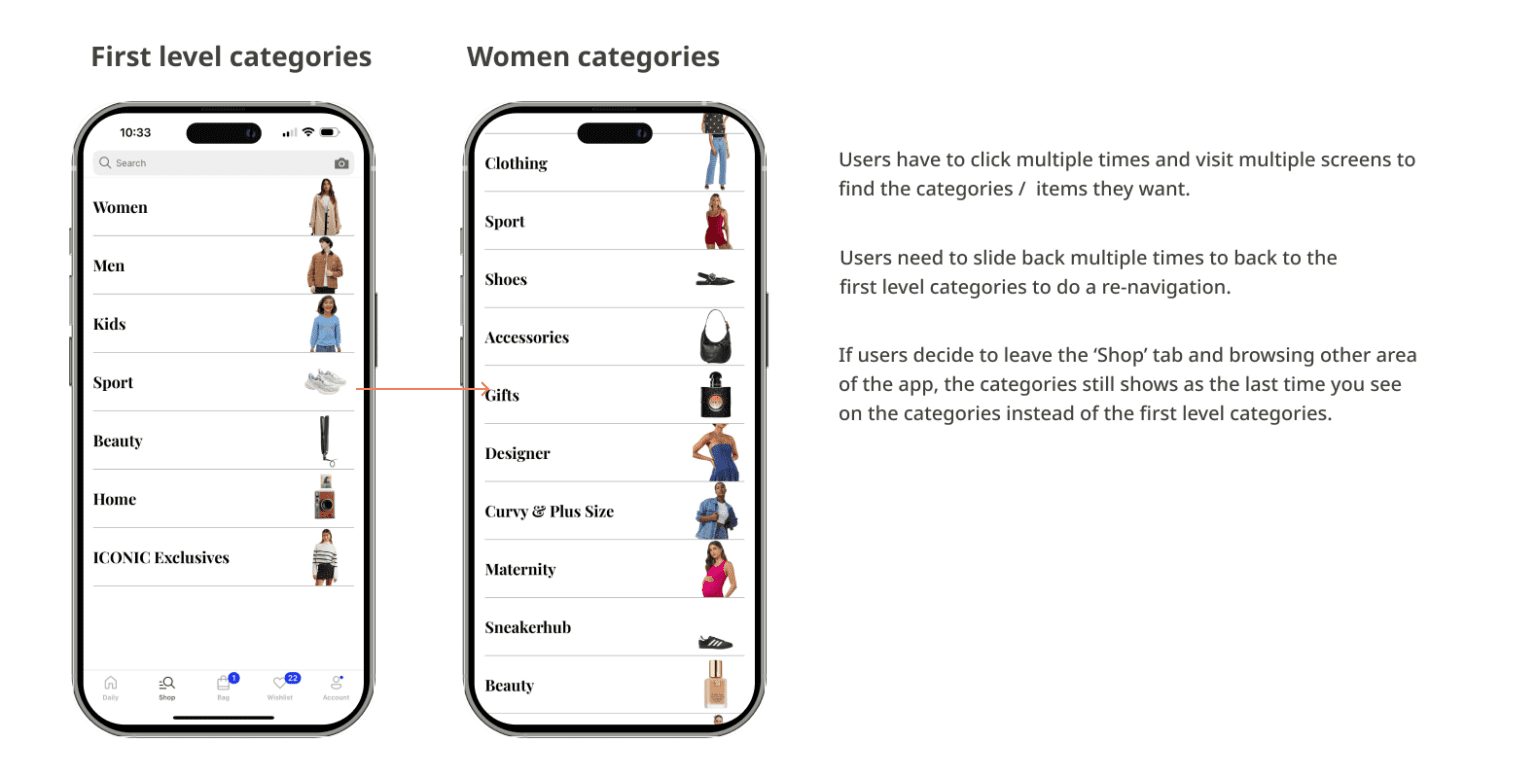
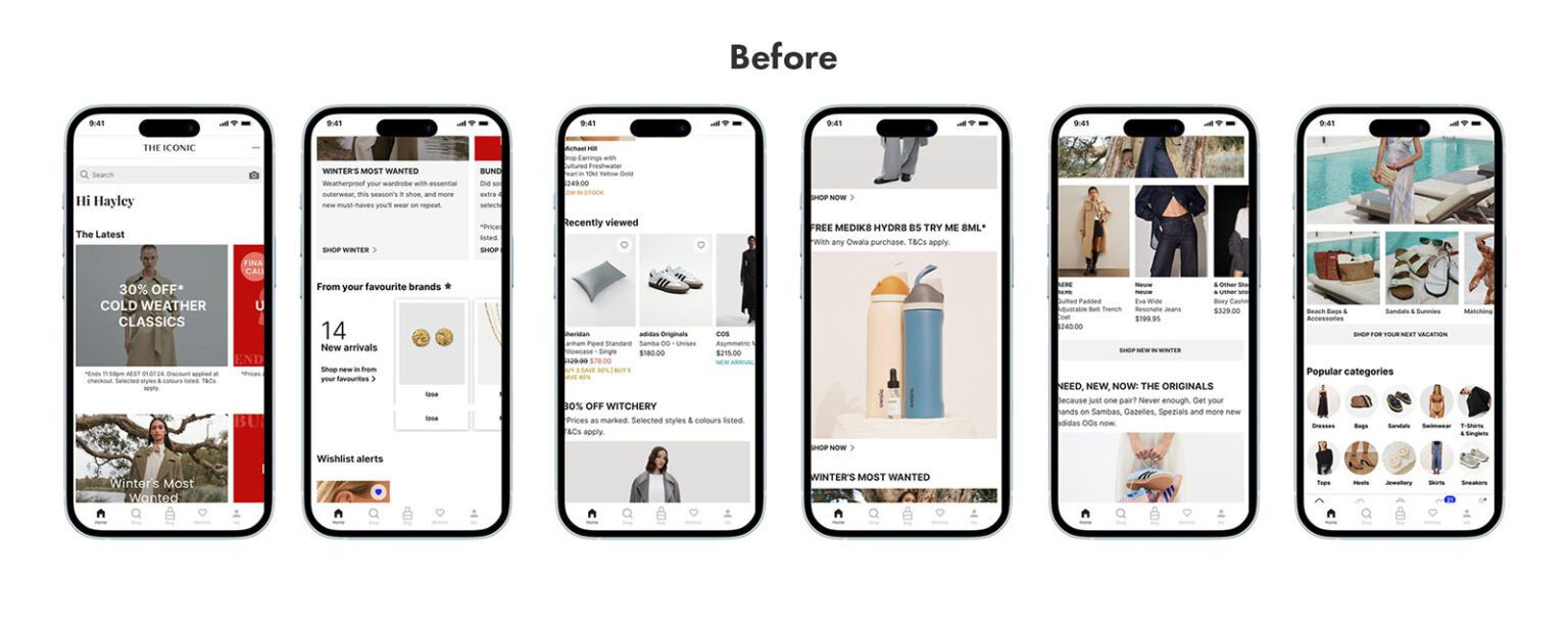
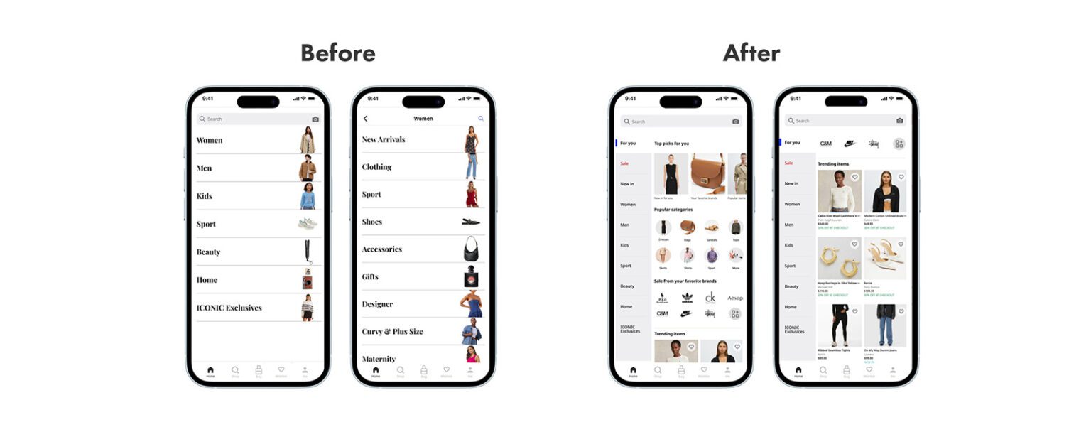
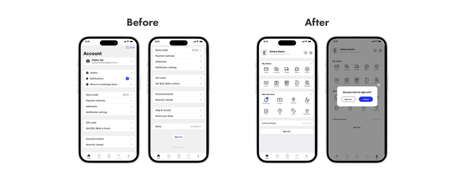
The iconic app still has some shortcomings in the flow when users access menus and features, for example, the home screen has many large-size pictures but does not provide obvious CTA signs/buttons, which results in a waste of space; Also it is hard to navigate on Categories – it requires many clicks to find the target category. Therefore, it is necessary to make some adjustments so that users can more easily understand and quickly use the App.
Possible solution
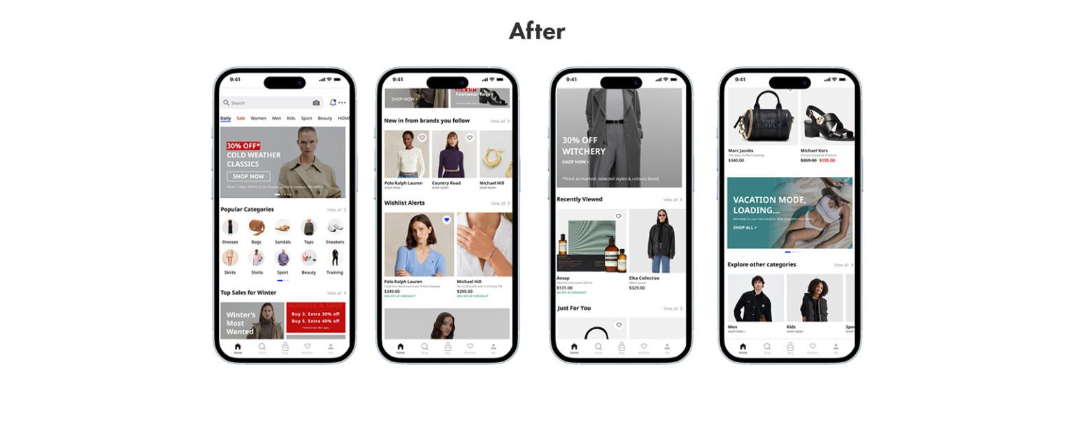
- Improve the home screen to make it more visually engaging.
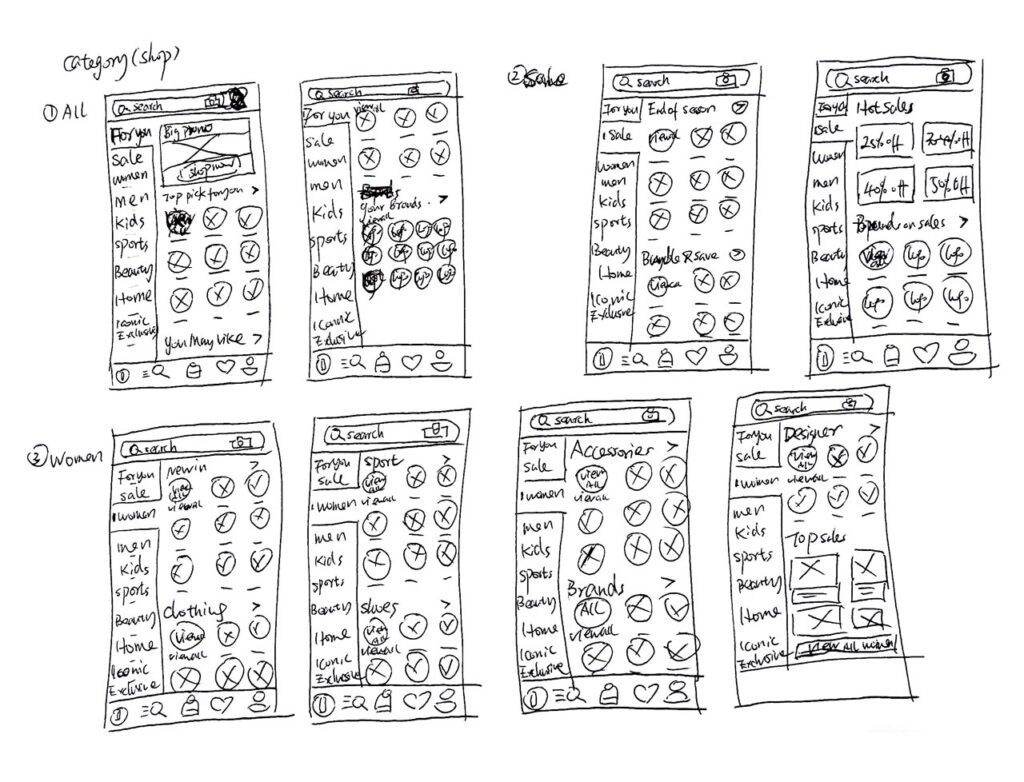
- Improve the Categories to make them more user-friendly, to allow users to find the products they want more quickly and easily.
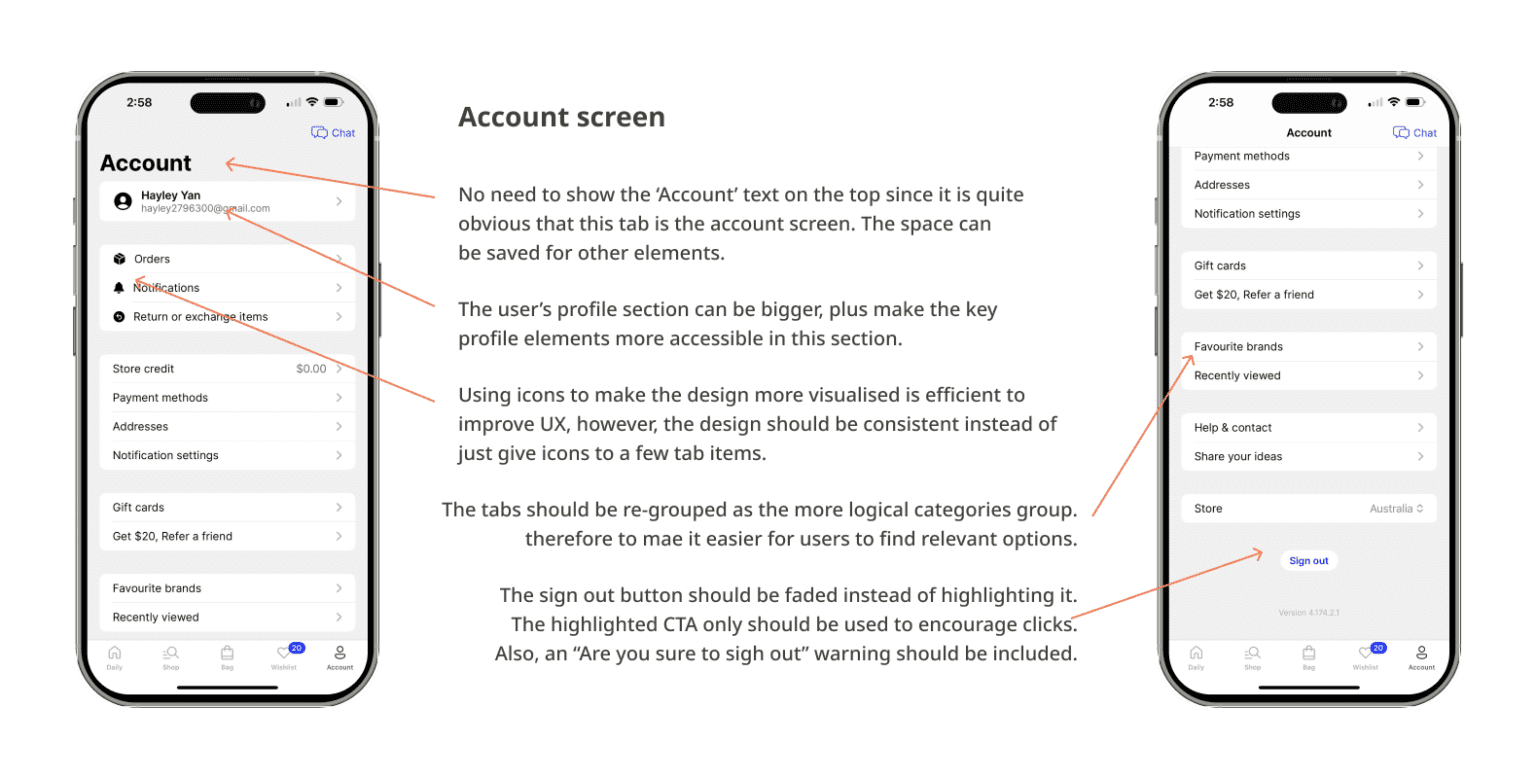
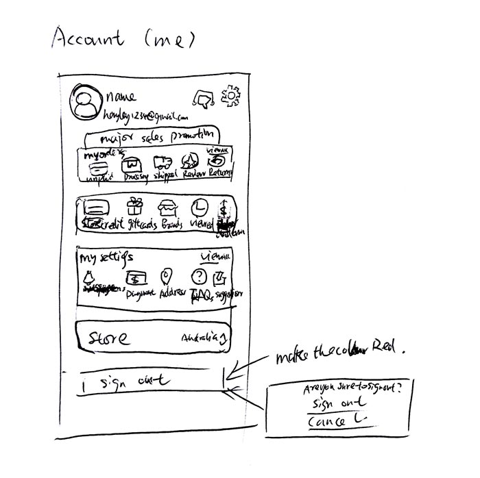
- Make the account screen more engaging and visually attractive, and also allow users to manage shopping activities more easily.
Target Audience
Age Group: 25-35 years old
Demographics: Tech-savvy, fashion-conscious, and active lifestyle
Preferences: Value convenience, personalization, and a visually appealing interface
Design thinking process
-
Identification of problem
I identify the problems present in the present in the current version of the app and frame a problem statement for it.
-
Research / Benchmarking
Researching to find the solution to the given problem by self and with reference to what other apps do.
-
Ideate
brainstorming to come up with the best possible solution to the given problems based on the research.
-
Sketching / Wireframing
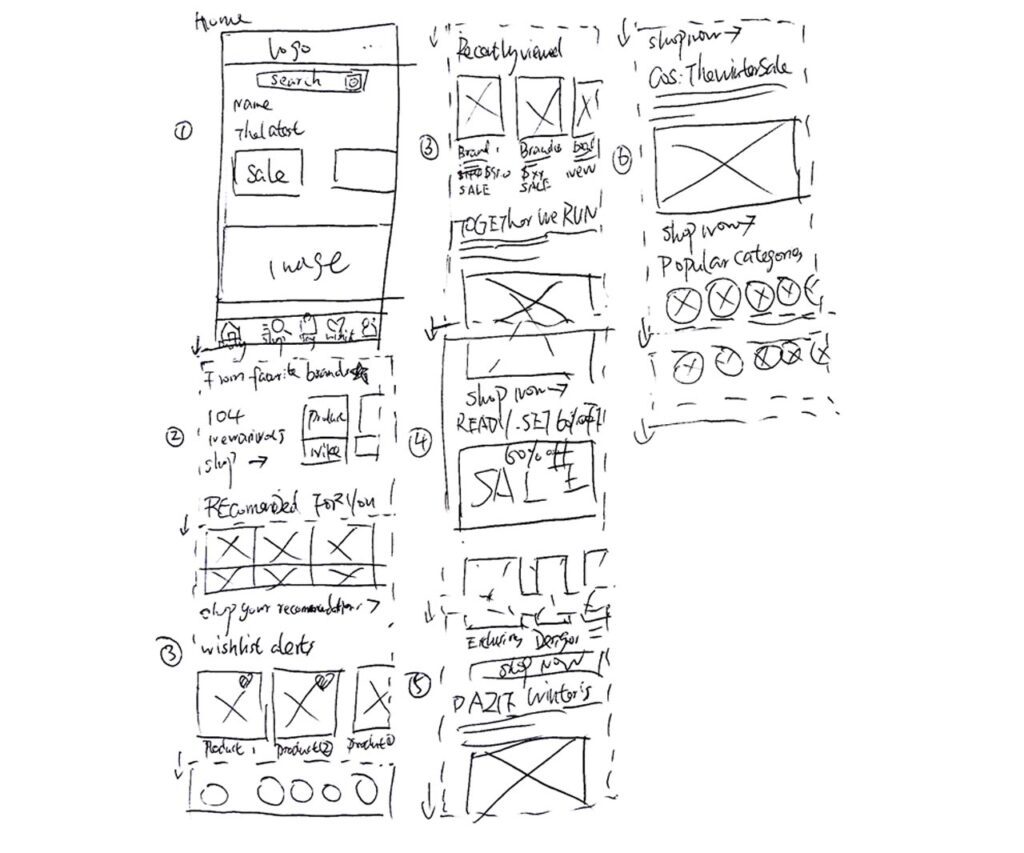
Draw the screens on a paper according to the ideation, I draw out the wireframes of the screen layout.
-
Designing
Based on the wireframes, I design and prototype the designs onto Figma for the final look and feel.
-
Testing
The final designs made are then analyzed for any errors in colours or font size, spacing and so on. Make sure everything pixel perfect and double check if there is anything. missing. Making improvements as needed.
Sketches
Home
Shop (Categories)
Account
Redesigned UI/UX
Based on the sketches that I drew above, I created and prototyped the designs onto Figma for the final look and feel.
Click below to view the prototype app in Figma:

