CPD Events Promotion Website
UI/UX | Web design | Design system | Prototyping
ACE Website UI/UX design
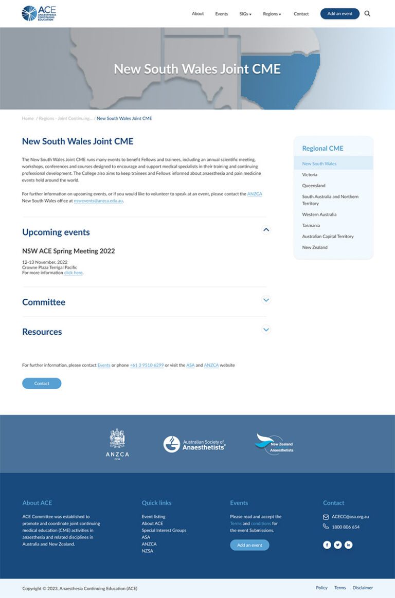
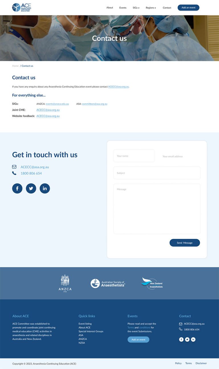
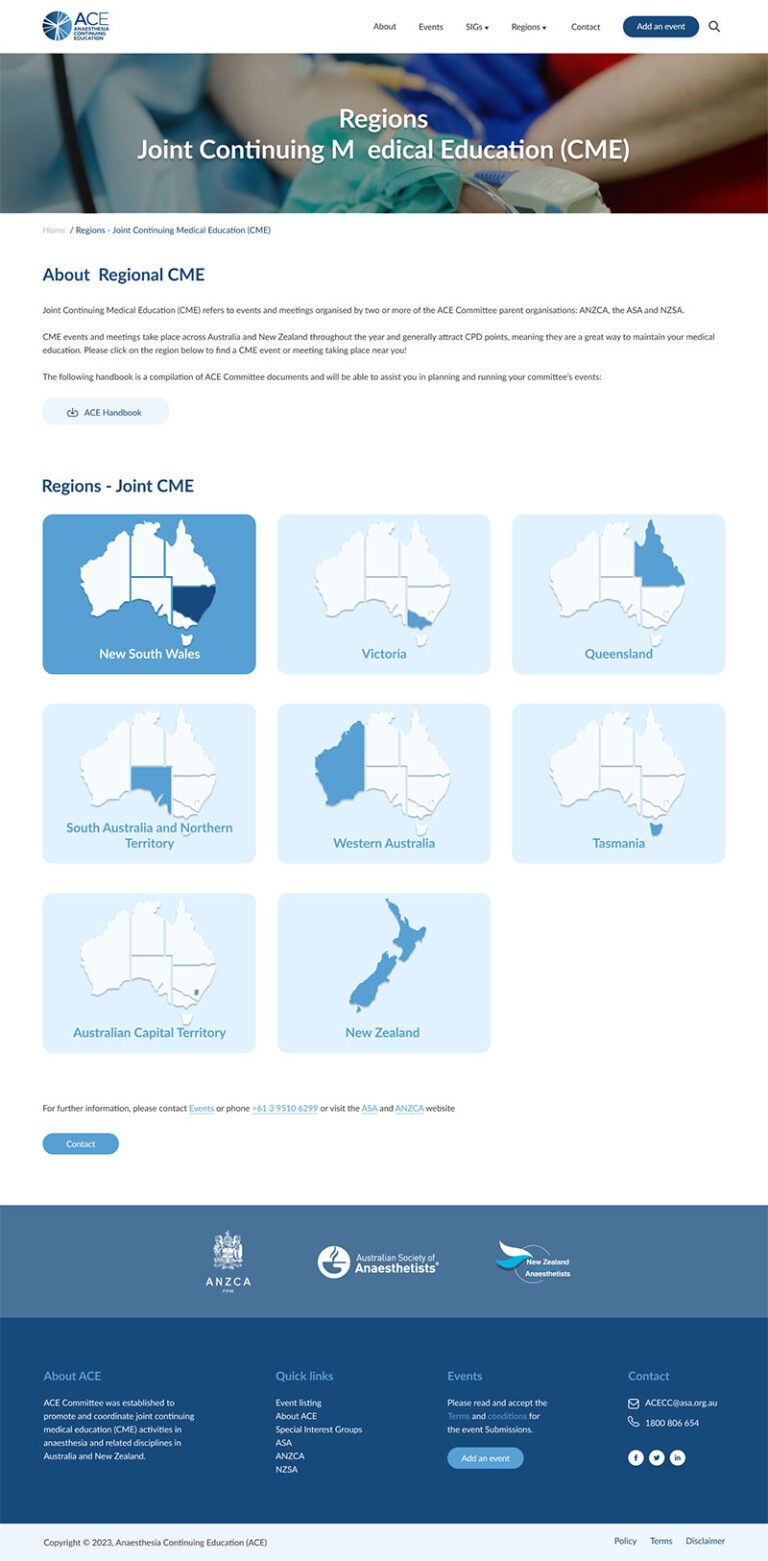
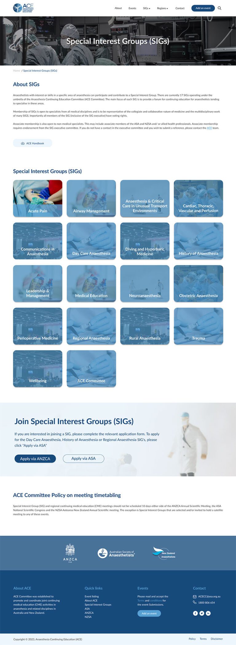
Redesigning the outdated website for the Anaesthesia Continuing Education (ACE) Committee was one of the biggest projects during my time at the Australian Society of Anaesthetists (ASA), This website was built and managed by the ANZCA, ASA, and NZSA. The UI of the site hasn’t been updated in 15 years since it was established. The old site was unattractive, buggy, hard to navigate, and difficult to update. Following ACE’s branding guidelines, I gave the website a fresh, modern look using Figma for wireframes and prototypes. The new design is user-friendly, easy to update, and makes it simple to find and post events, fixing all the issues that plagued the old site.
Live site: www.acecc.org.au
Category: UI/UX, Web design, Design system, Prototyping
Date: 2023
Tools: Adobe Photoshop, Illustrator, Figma, WordPress
Please note: This project serves solely as a showcase of my design skills. All work produced during my tenure at the Australian Society of Anaesthetists (ASA) remains the intellectual property of ASA. All rights reserved.
Why was a redesign needed?
- The UI of the site was never been updated since it was created 15+ years ago.
- The old site got frequent error messages for both users and myself when updating content on the pages,
- The website was based on an unmanageable CMS which made it difficult to post and approve events.
- Poor search functionality, and complicated navigation.
My contributions
- Identified key audience groups and analyzed the challenges they face.
- Outlined essential functionalities to enhance the website’s accessibility and user-friendliness for event organizers and visitors.
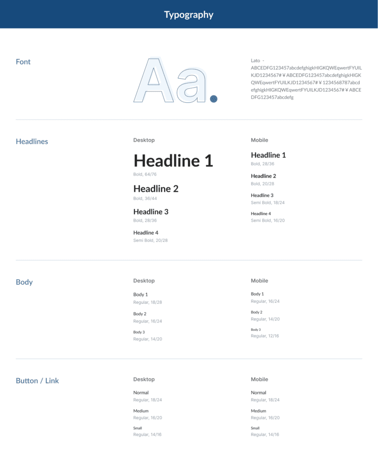
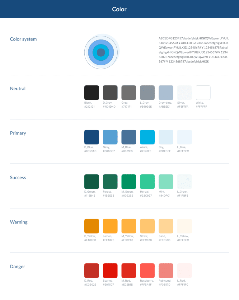
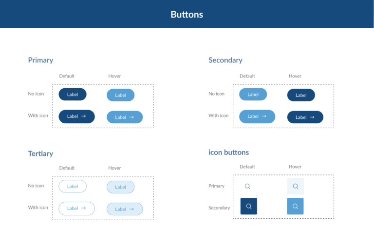
- Independently developed a comprehensive design system, including colour schemes, typography, icons, graphics, and buttons.
- Created wireframes and fully designed page layouts, and prototyped the website using Figma.
The Design Process
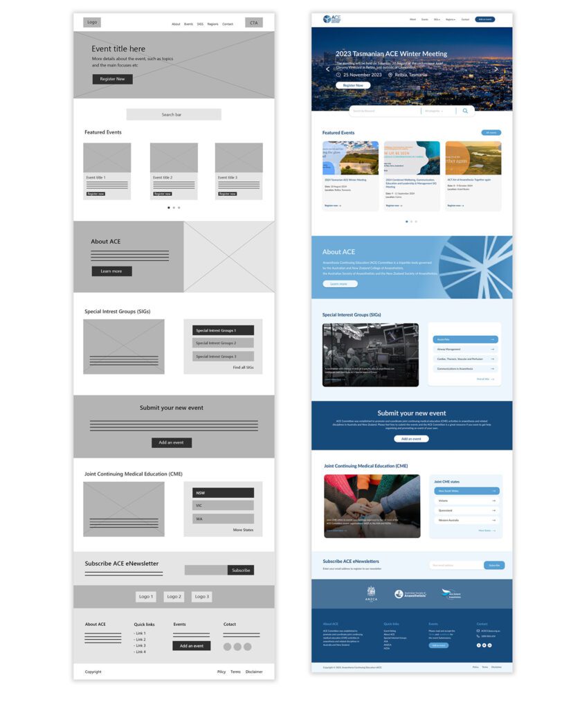
After establishing my task flow and conducting research, I started wirefaming the outline of the website, based on the content that best meets the business and user goals. Shown below is the low-fidelity wireframe and then the high-fidelity version of the Home page design.
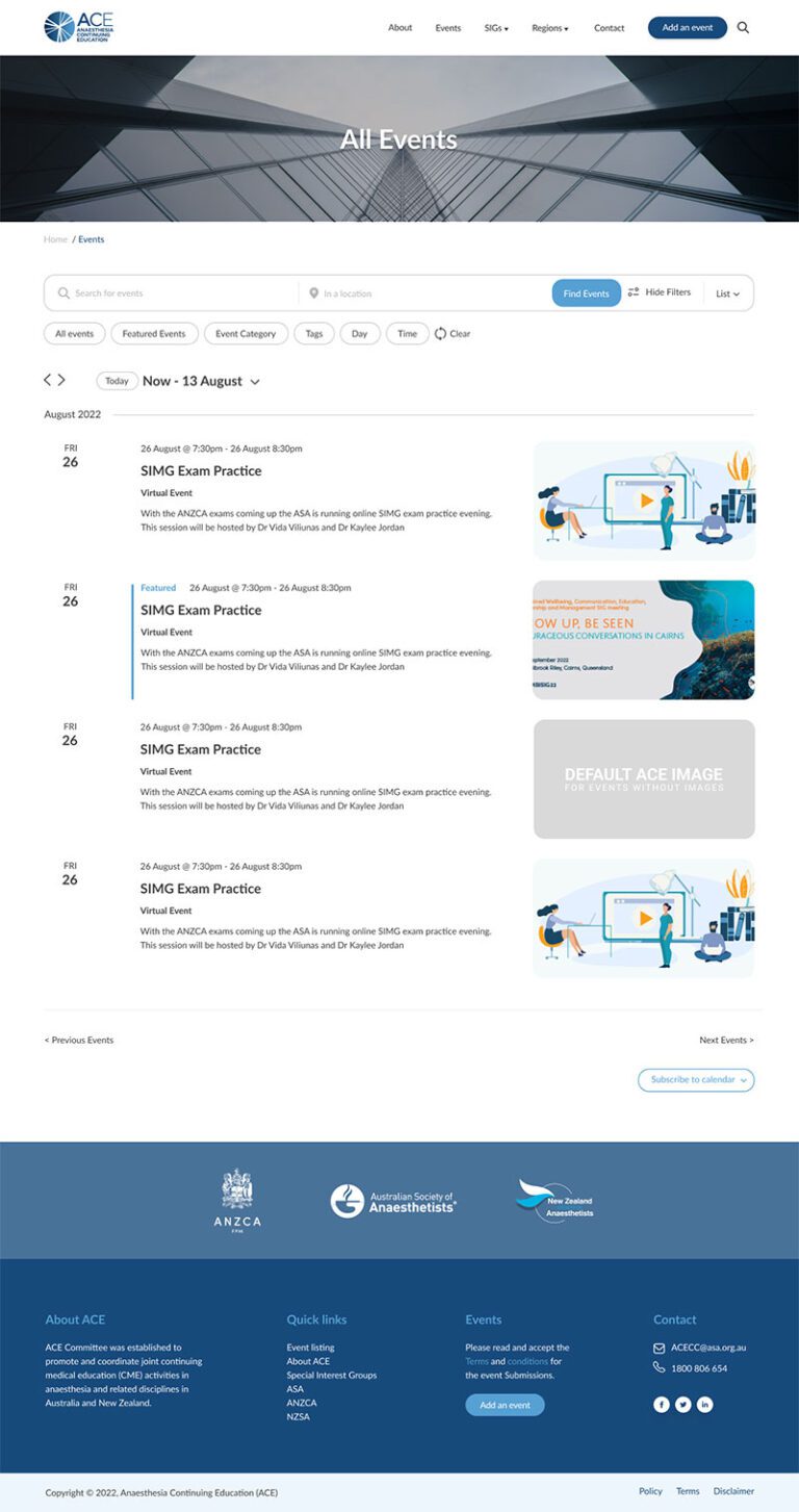
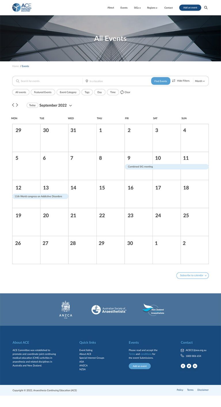
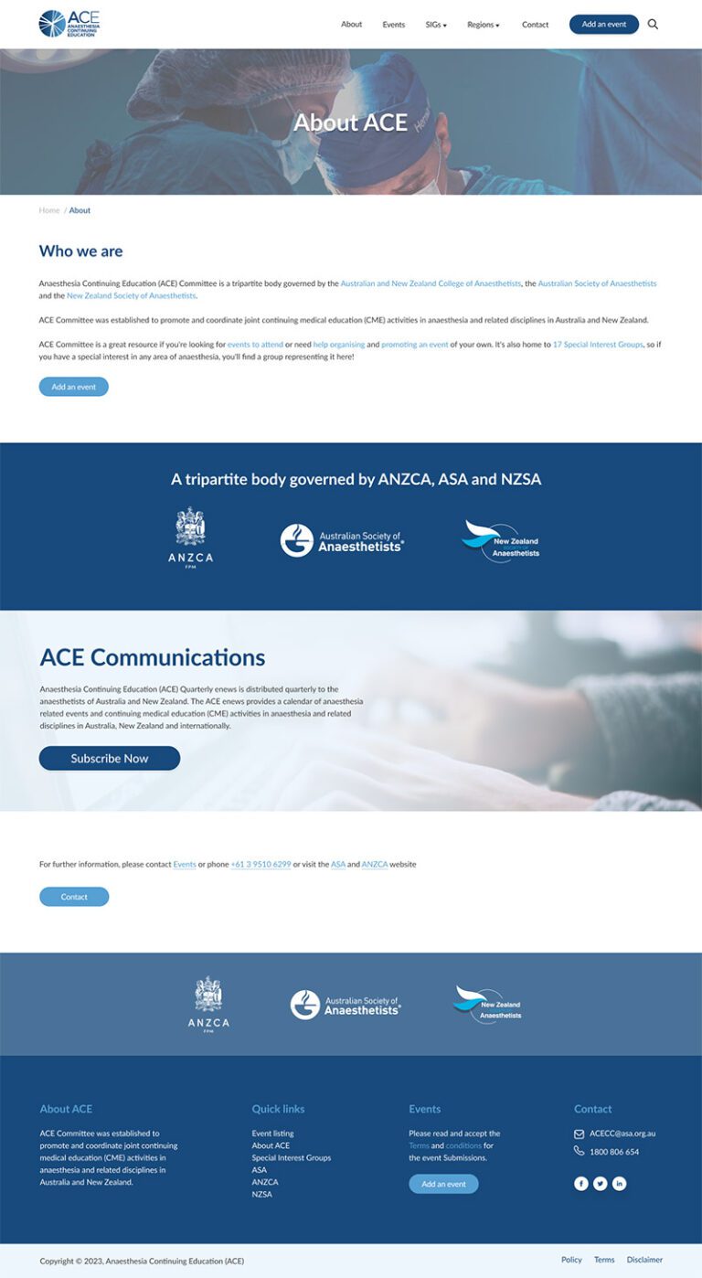
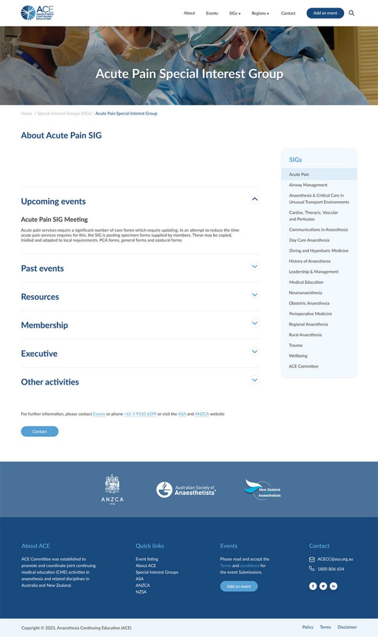
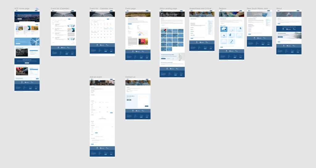
All the UI elements and webpages are developed/designed in Figma. below are the UI design of the main pages.
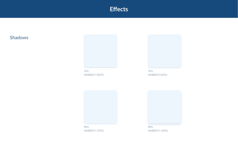
Design System
Design systems are essential for the design process because they ensure visual consistency, which improves the user experience. Before beginning the high-fidelity design, I first created a colour palette and set up systems for shadows, typography, and various website components. This approach resulted in a clean and polished final design that is more user-friendly for the audiences.


